UI/UX mobile app design for the “TransTechService”
Design 200+ screens for Android and iOS platforms in light and dark themes.
Made in 2020
Task
Update the interfaces of existing applications. Develop and add new screens. Implement a dark theme for major mobile platforms.
Problem
The Customer already had mobile applications placed in stores. The first task was to create a screen design for the new “Bonus System” section. It was necessary to develop the UI-design of the application based on ready-made UX-mockups. At the same time, it was not necessary to be guided by the appearance of existing screens – they were also planned to be updated: to make them more modern and clear and to add functionality.
That is, we were not just creating another section, but defining a new design concept for the application. The screens should be made in two themes – light and dark.
Solution
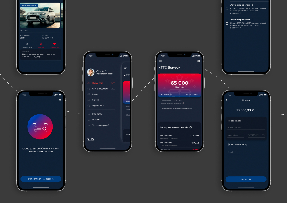
Bonus system
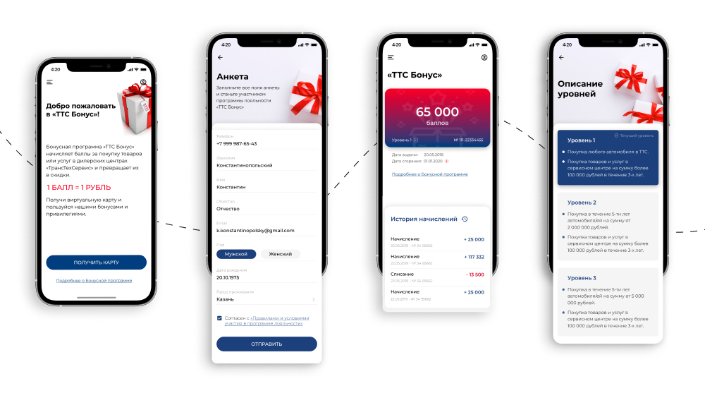
So, the work started with the design of the loyalty program. The essence of the new section is to provide the client with an opportunity to quickly issue a virtual bonus card, displaying up-to-date information about accrued points and debit history.
The customer provided prototypes with his vision of the task’s realization.
We have analyzed them for usability and prepared suggestions for improvement:
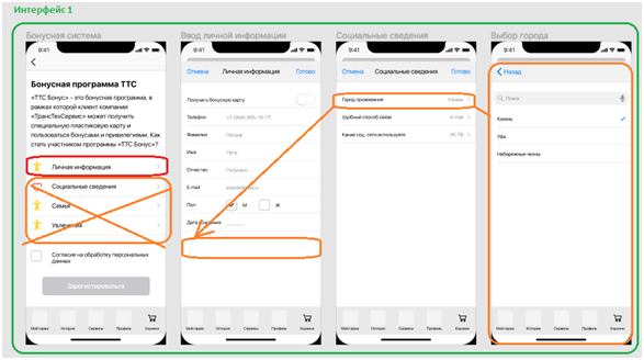
- The page of a registered user should be different from the screen of an unregistered user. If a person is not authorized in the system, they should be offered the opportunity to fill out a questionnaire to receive an online bonus card.
- It is necessary to think over the Questionnaire in such a way that the user is more willing to fill it out – not to overload it with questions, nobody likes to enter a large amount of data and perform many actions. If you divide the Questionnaire into personal information and other data (family, hobbies and social information), the probability that the user will go to all screens is small. Even if this information is mandatory, it will create inconvenience for the client and reduce the probability of bonus card registration.
- It is necessary to decide which variant of the bonus card is preferable – a real “plastic” card or an online card.
The customer accepted the proposed changes, and we started working.
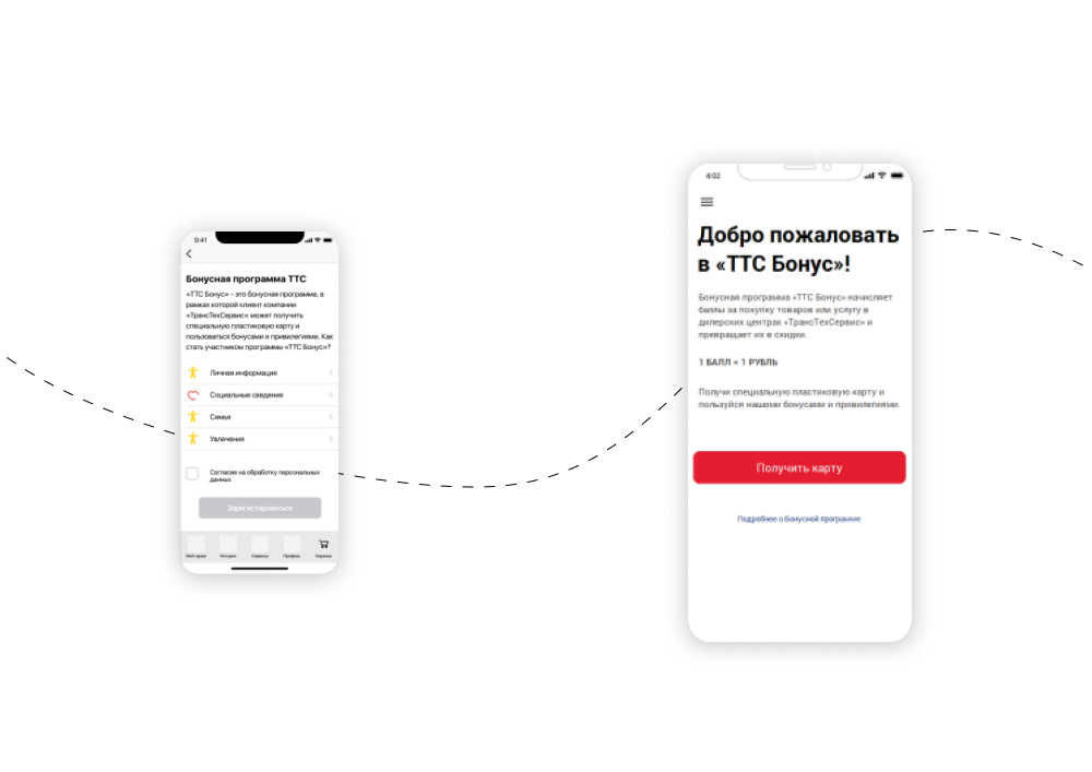
For a new user, they removed from the start screen the transitions to filling in personal data and left only one button: “Get Card”. This way, the user immediately understands what target action is expected of him.
For those who already use a virtual bonus card, the start screen displays card data, the number of points, and accrual history. The link “Questionnaire” allows you to add or change personal information.
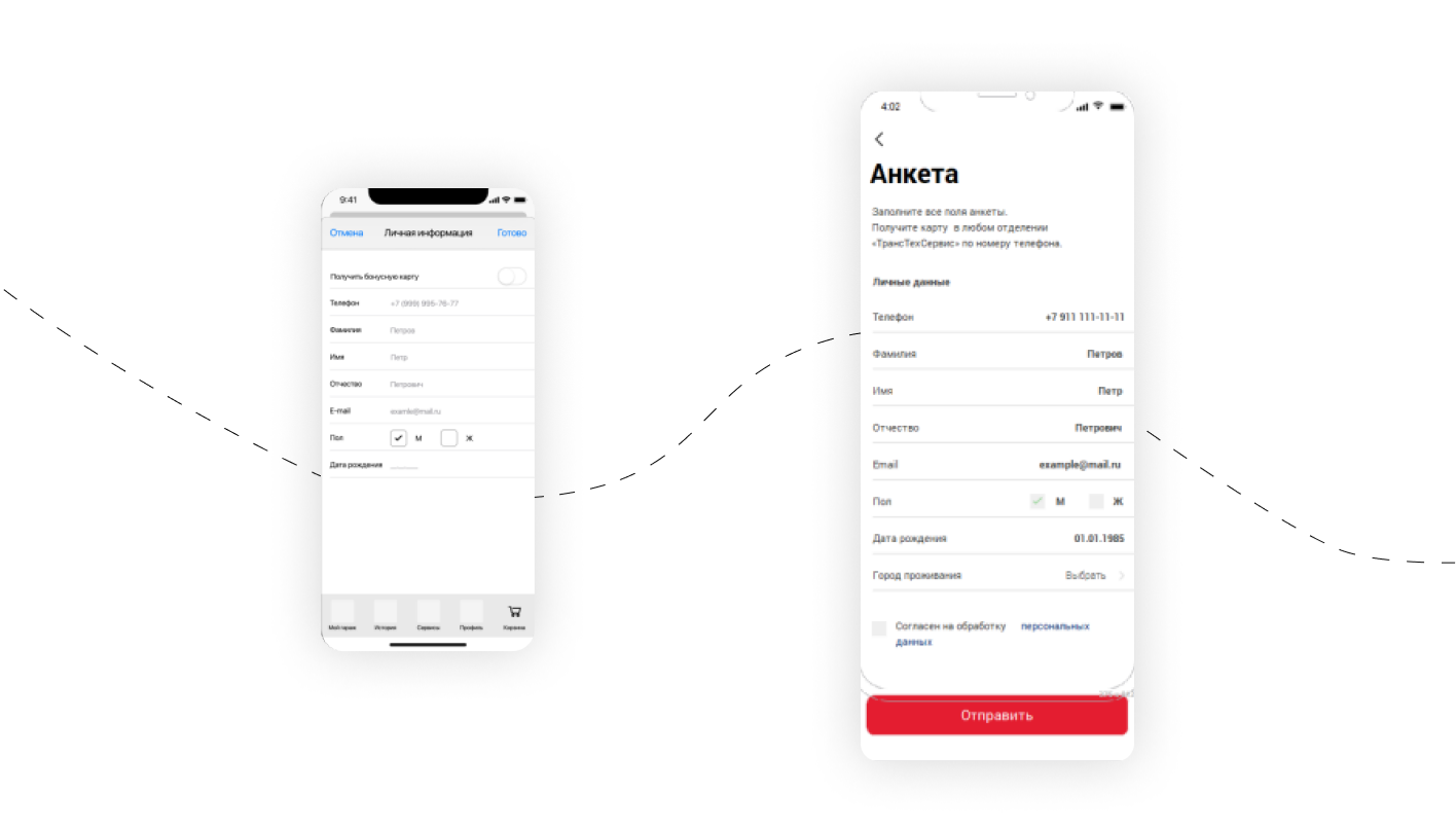
The division of data when filling out the Questionnaire has been removed. Such division creates inconvenience for the client: he has to go to the section, fill in the Questionnaire, click “Save,” and go back. And so for each item – 12 clicks. The probability that the user will fill in all the data in this case is small. After we removed data filling from the start screen and merged the Questionnaire, the number of clicks decreased to one!
The customer chose to use a virtual card, as this option would be even more convenient for the user: they don’t need to carry a card. Plus, it is an additional incentive to have a mobile application installed.
Other screens
We have worked on the new design of the catalog. Each car card displays the following information: model, year, mileage, drive system, transmission and body type.
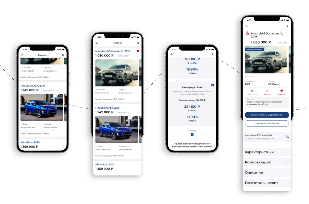
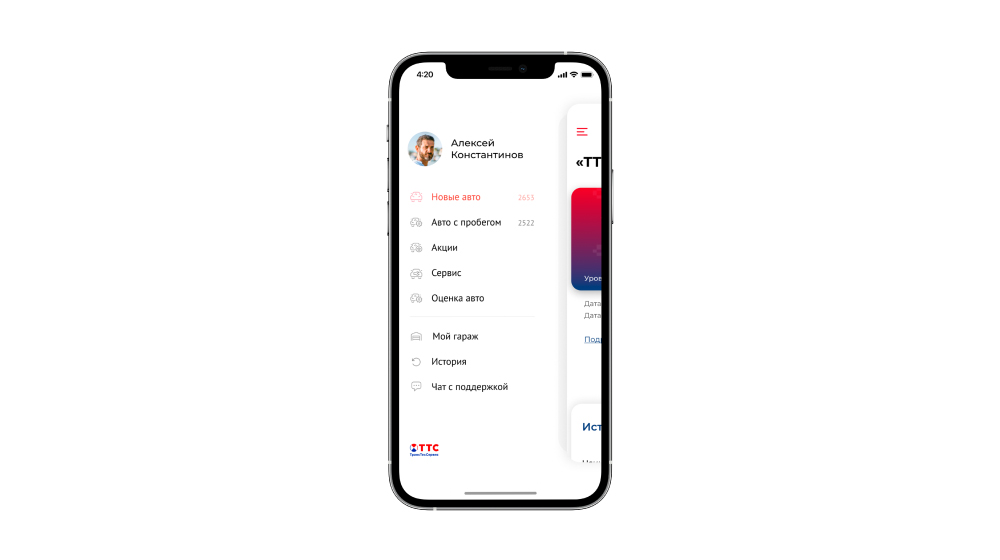
Implemented a left-side menu for easier interaction with the app.
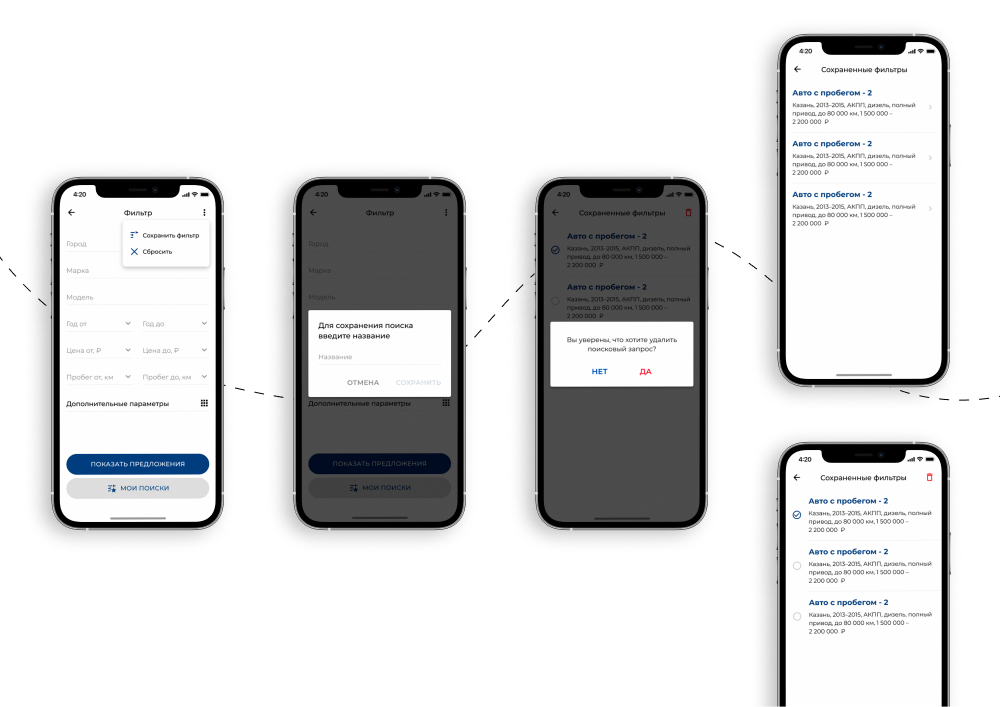
For the convenience of the user, when choosing a car, a filter with many criteria is used. For example: make, model, price range, year of manufacture, mileage, etc.
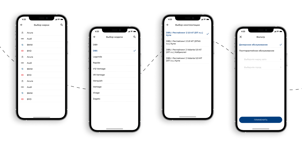
The selected filter settings can be saved.
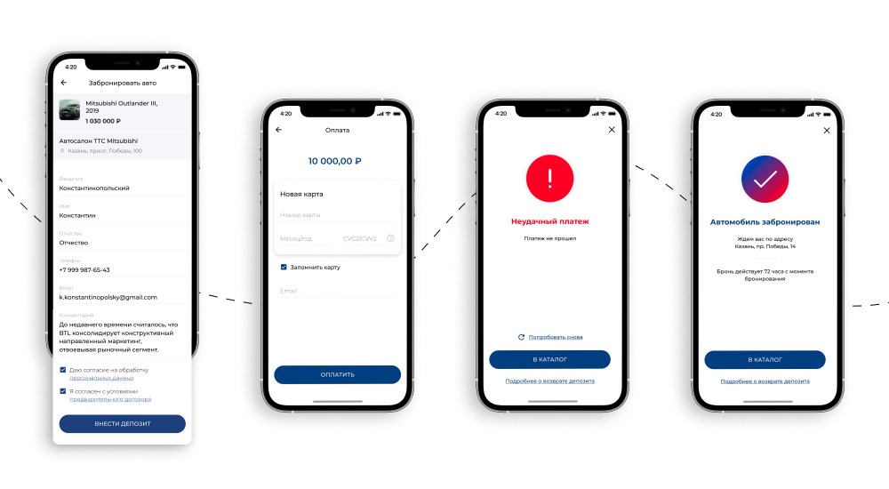
You can use the mobile app to book a car and prepay for it.
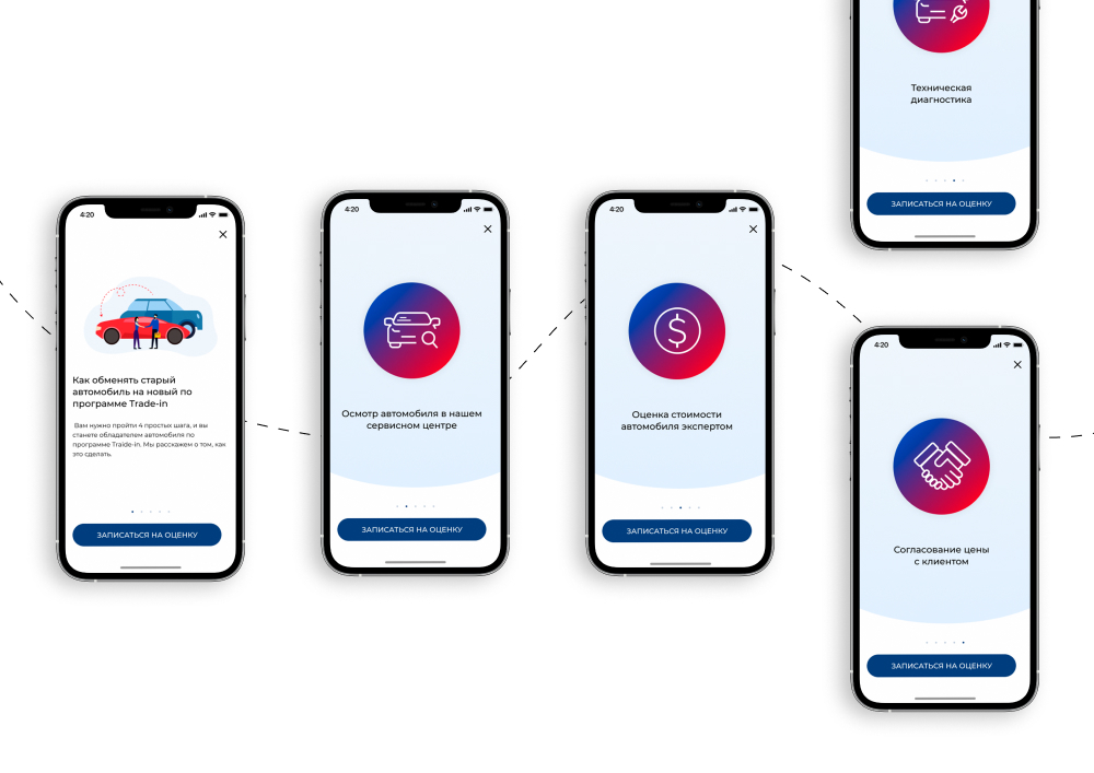
The “TransTechService” company offers its clients the Trade-in service. We have prepared 4 screens for each step of the car valuation appointment.
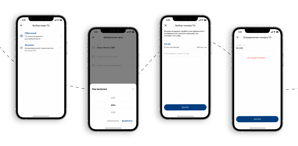
You can book a maintenance appointment via the app. To make an appointment, you need to specify the make of the car, the choice of maintenance type, mileage, equipment, and model. Then it automatically calculates which service number is required, it can be selected manually.
This is already usual work for us, we have already done similar functions in the iCherga and AvtomoykiRU applications.
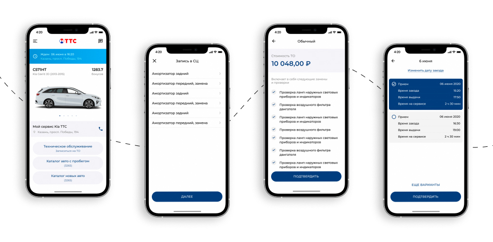
Before confirming the appointment, a screen with the list of services and the total cost of the service is displayed. When the user has made an appointment, a reminder of the appointment is displayed on the screen: service address, date and time.
Dark Theme
After the light theme screens were implemented on both platforms (Android and iOS), we worked out the design of the application and in the dark theme.
Do you like the work?
Send a request
Email us at info@itbrick.ru or send a request.